Business Identity

Visual Media

7a-deborah-owen-mockup

DESCRIPTION

Create a logo for a company/service/organization and establish a visual identity across documents.

PROCESS


Right away I knew what I wanted to do, I just didn’t have a clear vision of it. I started sketching logos like crazy, but nothing seemed to work. I knew that I wanted something minimalistic and abstract. What I really wanted to do was find a clever way to intertwine the illustration and typography. I also knew that I wanted to represent the saxophone and the piano in some way.

After a lot of sketching, I still hadn’t come up with anything I really loved, and so I opened up Illustrator and started playing around with shapes. I figured if I have the shape of a saxophone and the shape of a piano, I’d be able to play around with it more freely. Pretty quickly I was able to come up with two very different concept designs that I loved. Knowing I was supposed to have a third logo design, I tried doing something creative with just typography, and while I didn’t love it I thought it could potentially work really well.

6C Logo-05.jpg

I then took to Facebook, asking for critiques and votes from friends. There was a great divide between #1 and #3, to the point where people I respect who don’t know each other got into heated arguments with one another. In the end, the majority of people preferred the first one, though notably my real-life client (hi, Dad!) preferred #3. Since I was left ultimately undecided, I created letterheads for each. By the time I got to creating business cards, however, I found myself preferring #3 for its simplicity and versatility. While I still love #1, I decided that at least for now my attention had to be on #3.

At this point, I knew that what I’d done was adequate, but I wasn’t loving it. My biggest issue was that it felt really dated, and just sort of boring. I knew there was more I could do, but I was stuck.

CRITIQUE PROCESS

Sister Godfrey was so helpful and patient with me this week. In her critique, she pinpointed exactly where the disconnects were in my design. The alignment was weird, and the watermark and top border made it too busy. After going through and adjusting things I was so much happier with it. She also suggested I tie in color to make it stand out.

My dad, the real-life client, gave some valuable feedback as well. He liked the designs after I had applied Sister Godfrey’s feedback. His one suggestion was to experiment with the piano keys running up the right side of the page. It was a good idea, but left the bottom feeling pretty unbalanced.

MESSAGE

Owen Music Studios provides quality music education in the Puget Sound area!

AUDIENCE

Music students at all levels (and their parents)!

TOP THING LEARNED

  1. Watermarks are not necessary on letterheads (a lot of times they’re just clutter).
  2. InDesign doesn’t use clipping masks like Illustrator (which only created a moderately sized headache).

COLOR SCHEME & COLOR NAMES

Monochromatic: Purple (with black)

TITLE FONT NAME & CATEGORY

Museo Slab | Slab Serif

COPY FONT NAME & CATEGORY

Museo Sans | Sans Serif

THUMBNAIL OF ORIGINAL, UNEDITED IMAGES USED IN PROJECT

N/A

SOURCE OF IMAGES


My own graphics

Montage

Uncategorized, Visual Media

DeborahOwen-6AMontage1.jpg

DESCRIPTION

Design a spiritual poster montage using the blend of images and type.

PROCESS

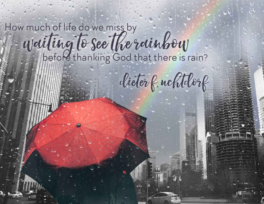
This has probably been my favorite project so far in this class! I had a couple different concepts bouncing around my head as far as quotes and images I could combine, but nothing was working. And so I did what any good Mormon would do: I googled “Uchtdorf quotes” and found my inspiration right away.

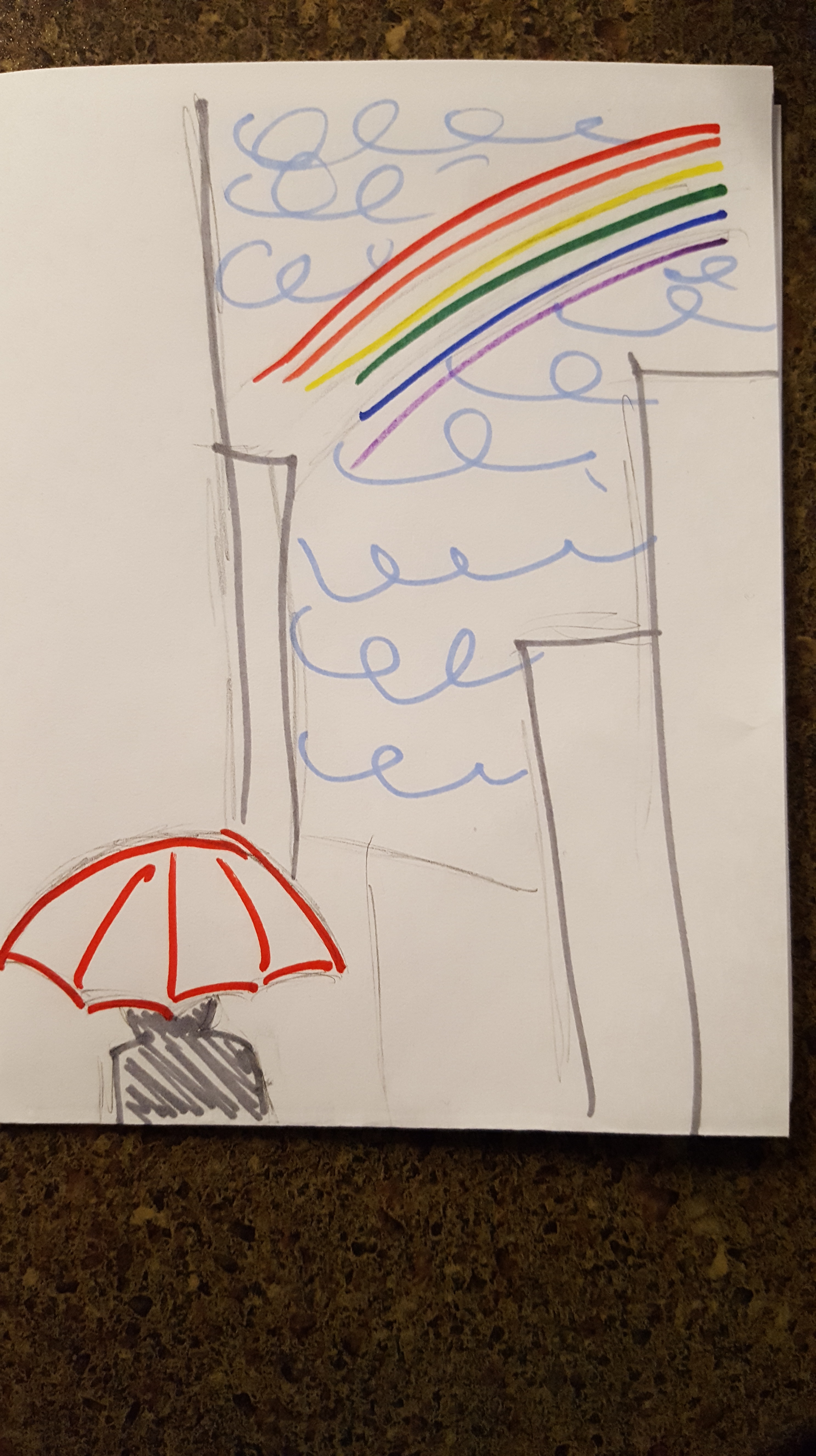
Before even opening Photoshop, I sketched out what I wanted the layout of the image to be. Once I had that developed, I started gathering photos. I was surprised by how quickly I found the perfect umbrella, and how long it took me to find a good city view. I downloaded all of these photos in high resolution and opened them up in Photoshop. From there, I worked my way up through each layer.

20161017_171346.jpg

The first layer was the rainbow photo.One patch of sky was a lot brighter than the rest, so I filled it with a content-aware background which sampled from the gray sky around it and blended really well. I then applied a gaussian blur which removed most of the texture of clouds, while keeping just enough. The next layer was the city. I masked out the sky and decided to gradually blend out the tops of the buildings to make sure the montage was kept sort of dreamlike. The original photo was primarily black and white, but with blue and yellow reflecting off of the buildings. It distracted from the message enough that I decided to make it grayscale.

The umbrella was my most surprising find. The photo I found already had great contrast and vibrancy, and I wanted it to stand out. I masked it to include only the umbrella. I increased the brightness a little bit more to compensate for the fact that it was taken at nighttime. Last, I found a grayscale image of rain against a window and then used a screen mask to make it transparent. All the layers together already looked like a solid image. From there I only added really minor adjustments to make the montage more cohesive.

For the text, I knew I wanted to use a sans serif with a thick script font. I found a great pair to use and decided to stagger the alignment of each line of text for some variation. I added a soft glow behind it to help it stand out on the background. I aligned the text box in the left two-thirds.

draft2.png

CRITIQUE PROCESS

Sister Godfrey gave me some great critiques. She suggested I lighten the umbrella to make it a stronger focal point, and the add some color to the text (which was a really dark grayish blue). She also noted that the umbrella didn’t really align with the rule of thirds at all.

I followed all of Sister Godfrey’s critiques and then showed it to my sister Emily. She thought I should make the umbrella a little bit smaller and the text a little bit larger. She also recommended that I make the umbrella grayscale as well, but I really prefered how it mae the image pop so I left it that way.

MESSAGE

Be grateful in all circumstances.

AUDIENCE

People who need a reminder of gratitude.

TOP THING LEARNED

  1. Masking is a really cool tool once you know how to use it
  2. Breaking the rules can work sometimes, but only if you’re really careful

COLOR SCHEME & COLOR NAMES

Big Split Complementary: Yellow, Red, Dark Purple, Light Blue

TITLE FONT NAME & CATEGORY

Hello Sunshine  | Script

COPY FONT NAME & CATEGORY

TT Chocolates | Sans Serif

THUMBNAIL OF ORIGINAL, UNEDITED IMAGES USED IN PROJECT

SOURCE OF IMAGES

Rainy November by Thomas Backa via https://flic.kr/p/hwegdg

Rainbow by walmarc04 via https://flic.kr/p/oU3fCk

Umbrella by Gabriel Santiago via https://unsplash.com/photos/1vYkQVDWXl0

Chicago by Aidan Meyer via https://unsplash.com/photos/zJrupeAkPzI

Photodesign Project

Visual Media

5A DeborahOwen Draft4.jpg

DESCRIPTION

By using photography and design skills, create a project that encompasses a consistent color scheme from the image.

PROCESS


When I was taking my picture, I loved the contrast of the blue flowers amid the green and brown. Right away I thought about the phrase “bloom where you are planted” and got to work at home. I used Adobe Color to pick out a good color scheme for my photo, and then started playing around with things. I created a new 8.5×11 document in Photoshop and imported the photo. I adjusted the levels and saturation on the photo, and especially sharpened and brightened the blue flowers so they would really stand out.

I knew I wanted to keep things really clean, but also a little unpredictable. I placed each word in front of its own block and intentionally misaligned them while keeping nice flow. The text blocks went on top of a blue rectangle on the left third that helped organize the flow of the content. I made the key words stand out in a bold cursive font and paired it was a neutral sans serif for balance. Overall I thought my design was really well balanced, but I knew it needed more finesse.

5A DeborahOwen Draft1.jpg

CRITIQUE PROCESS

Sister Godfrey’s critique was super helpful. She suggested I scale the photo larger and adjust my color scheme to include teal. I had thought about doing both of these at some point, but never stuck with them because I couldn’t get it just right.


After I applied Sister Godfrey’s advice, I went to my mom (I know) for a critique. She agreed that it looked better with the picture scaled larger, but didn’t like the brighter color scheme I’d used to incorporate teal. And so I reeled it back into something with the more muted tones I’d already used with only a tiny splash of teal.

MESSAGE

Bloom where you are planted!

AUDIENCE

People who like flower metaphors and who need a boost

TOP THING LEARNED

  1. It’s a lot harder to be precise in Photoshop than it is in Illustrator
  2. There’s always an attractive way to incorporate a new color

COLOR SCHEME & COLOR NAMES

Analogous: Blue, Teal, Green

TITLE FONT NAME & CATEGORY

Buttercup  | Script

COPY FONT NAME & CATEGORY

Cera | Sans Serif

THUMBNAIL OF ORIGINAL, UNEDITED IMAGE USED IN PROJECT

IMG_0140.JPG

SOURCE OF IMAGE

Personal Photo taken on 10/08/16 near the I-Center.

Photography Activity

Visual Media

deborahowen-outside

Light 1 — Outside

deborahowen-inside

Light 2 — Inside

deborahowen-foreground

Focus 1 — Foreground

deborahowen-background

Focus 2 — Background

deborahowen-thirds

Composition 1 — Thirds

deborahowen-lead

Composition 2 — Leads

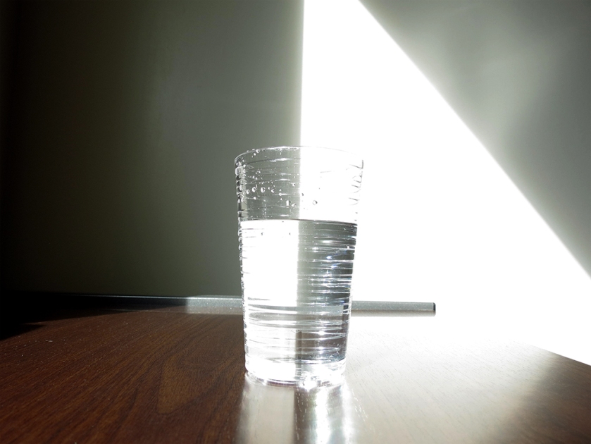
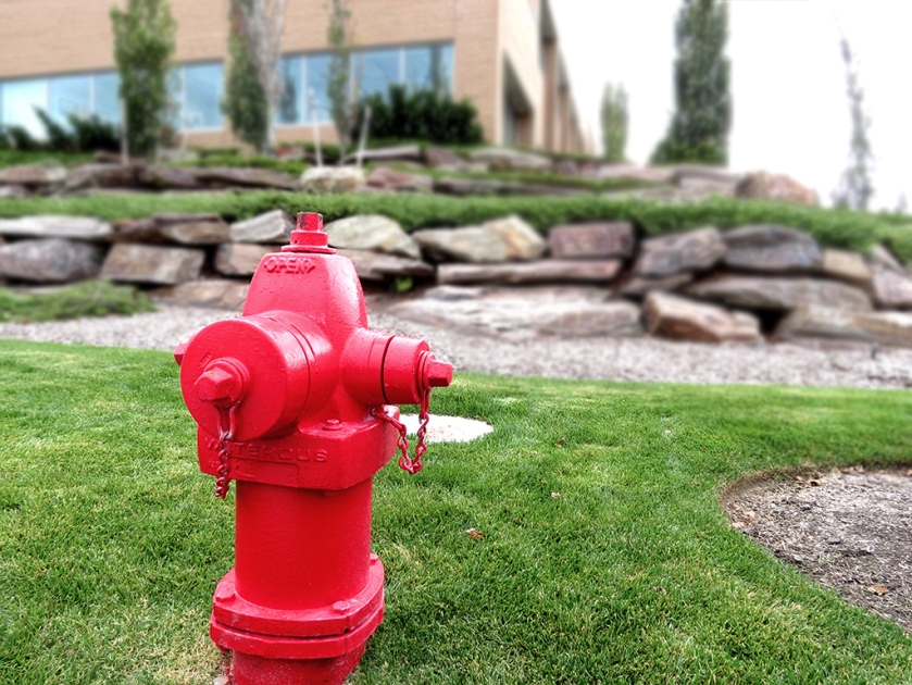
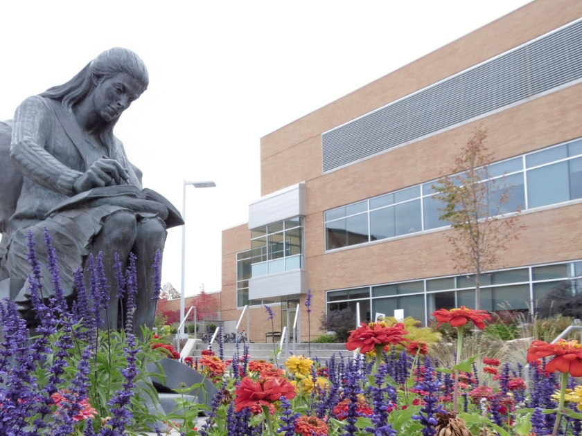
This was surprisingly challenging for me. I’ve never used a DSLR camera before, and I had a lot of fun playing around with the settings. The campus has a lot of great possibilities as far as subjects for photos. My outside photo had already been taken when as I was walking toward the Spori I noticed how bright blue the sky was. My indoor picture was actually really fun. I opened my curtain and saw the light hitting the table and wall perfectly. I thought of what kind of subject I could use and just grabbed a glass of water. the result is a lot cooler than I anticipated and really takes advantage of the super bright natural light that came in. The biggest challenge I faced was the fact that my camera would not let me manually focus it. I talked with several people who are familiar with DSLR cameras, and they couldn’t figure it out. I was able to get it to focus on the foreground and background a little bit, but not noticeably.

The biggest challenge I faced was the fact that my camera would not let me manually focus it. I talked with several people who are familiar with DSLR cameras, and they couldn’t figure it out. I was able to get it to focus on the foreground and background a little bit, but not noticeably so I did Photoshop it more than I wanted to in order to emphasize the intended focus.

I really enjoyed composing the thirds photo. I noticed how the tree and building window both lined up really well, and then I noticed where the rocks loosely fell on the lower third line. For my lead photo, I thought it would be interesting to use a statue as my subject. While this has the remaining space filled with a building, it still is in the background and the subject leads into the rest of the photo.

I learned just how much a little bit of Photoshopping can do–especially adjusting the levels. I’m excited (and scared) to dabble in a little bit more photography. This activity was intimidating, but now that it’s done I’m interested in pursuing it further.

Video Production and Broadcast Journalism

Intro to Communication

Today we got to hear from two people I was happily already familiar with. Brother Mawlam is in my bishopric and I’ve watched BYUTv content from Brother Howard before, so that added another layer of interest to the class. It was interesting to hear about the contrast between traditional video production and live video broadcasting. I subconsciously knew all the different tasks involved in video production, but to have them each spelled out and explained within a real life situation gave me a better grasp of the reality. I have (not seriously) considered working in film, and might still do a cluster in video production, so I really appreciated the insight from people who have a lot of real-life experience in the industry.

Prezi Presentation: How to Build an Ice Cream Sundae

Visual Media

screenshot

DESCRIPTION

Create an instructional presentation using the Prezi software to demonstrate it’s features and capabilities.

PROCESS

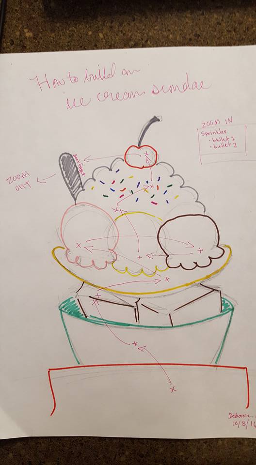
sketch.jpg

I had no clue what I wanted to do for my how-to Prezi initially. Gradually, I started thinking about doing some sort of recipe, since that follows a pretty methodical process (usually), plus food makes for a great visual. I knew I didn’t want to include photos, and I didn’t have the time to create a really intricate vector, so eventually that lead me to an ice cream sundae. It’s easy to follow, fun, and wouldn’t take hours in Illustrator (though I did, admittedly, spend several hours creating and tweaking this illustration).

I got it all sketched out, including the general flow I wanted. I envisioned a sort of “Magic School Bus” experience of zooming super close and being immersed in it. Then I went into Illustrator. I stuck with a flat design, adding each element on a new layer. Originally I exported each individual element as a .png file, but that both took a lot of time, and looked grainy when zoomed in a couple thousand percent. I added my text, and while I wasn’t super happy with the fonts, there were only so many options.

CRITIQUE PROCESS


Sister Godfrey’s critique covered all of my concerns. Her biggest things were adding an illustration to each slide, changing the header fonts, and having less dramatic animation. She also mentioned setting the text on a fade-in timer. While I wasn’t able to figure that out (I just got rid of the fade-in altogether), I changed each of the other things and was super satisfied with the results.

My sister Hannah gave me some good critiques as well. In addition to suggesting some changes to the text, she offered the same comment about the header font. Another big change she persuaded me to do was upload my illustrations as vectors (which I learned how to do here: https://prezi.com/support/article/creating/inserting-complex-graphics/) so it wouldn’t look grainy, which I’m really happy I did. The file is also smaller and loads faster.

MESSAGE

Ice cream sundaes are easy to make!

AUDIENCE

People who want a PERFECT ice cream sundae, not a mediocre one.

TOP THING LEARNED

  1. How to add vectors to Prezi
  2. You can always find the right font pairings, even with limited options

COLOR SCHEME & COLOR NAMES

Triadic: Pastel pink, blue, and yellow

TITLE FONT NAME & CATEGORY

KG Empire of Dirt | Decorative

COPY FONT NAME & CATEGORY

Aleo | Slab Serif

THUMBNAIL OF ORIGINAL, UNEDITED IMAGE USED IN PROJECT

ice cream sundae.png

SOURCE OF IMAGE

Personal Illustration