
DESCRIPTION
Design a spiritual poster montage using the blend of images and type.
PROCESS
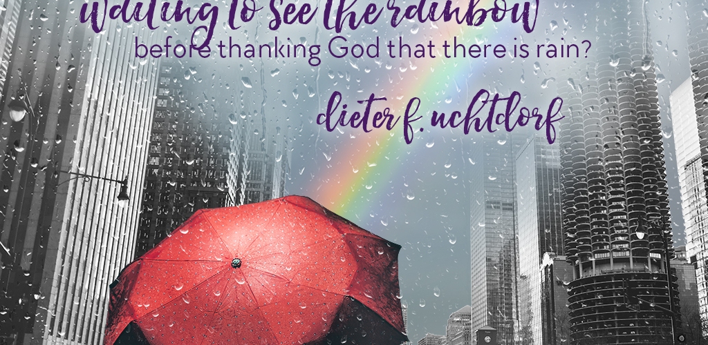
This has probably been my favorite project so far in this class! I had a couple different concepts bouncing around my head as far as quotes and images I could combine, but nothing was working. And so I did what any good Mormon would do: I googled “Uchtdorf quotes” and found my inspiration right away.
Before even opening Photoshop, I sketched out what I wanted the layout of the image to be. Once I had that developed, I started gathering photos. I was surprised by how quickly I found the perfect umbrella, and how long it took me to find a good city view. I downloaded all of these photos in high resolution and opened them up in Photoshop. From there, I worked my way up through each layer.

The first layer was the rainbow photo.One patch of sky was a lot brighter than the rest, so I filled it with a content-aware background which sampled from the gray sky around it and blended really well. I then applied a gaussian blur which removed most of the texture of clouds, while keeping just enough. The next layer was the city. I masked out the sky and decided to gradually blend out the tops of the buildings to make sure the montage was kept sort of dreamlike. The original photo was primarily black and white, but with blue and yellow reflecting off of the buildings. It distracted from the message enough that I decided to make it grayscale.
The umbrella was my most surprising find. The photo I found already had great contrast and vibrancy, and I wanted it to stand out. I masked it to include only the umbrella. I increased the brightness a little bit more to compensate for the fact that it was taken at nighttime. Last, I found a grayscale image of rain against a window and then used a screen mask to make it transparent. All the layers together already looked like a solid image. From there I only added really minor adjustments to make the montage more cohesive.
For the text, I knew I wanted to use a sans serif with a thick script font. I found a great pair to use and decided to stagger the alignment of each line of text for some variation. I added a soft glow behind it to help it stand out on the background. I aligned the text box in the left two-thirds.

CRITIQUE PROCESS
Sister Godfrey gave me some great critiques. She suggested I lighten the umbrella to make it a stronger focal point, and the add some color to the text (which was a really dark grayish blue). She also noted that the umbrella didn’t really align with the rule of thirds at all.
I followed all of Sister Godfrey’s critiques and then showed it to my sister Emily. She thought I should make the umbrella a little bit smaller and the text a little bit larger. She also recommended that I make the umbrella grayscale as well, but I really prefered how it mae the image pop so I left it that way.
MESSAGE
Be grateful in all circumstances.
AUDIENCE
People who need a reminder of gratitude.
TOP THING LEARNED
- Masking is a really cool tool once you know how to use it
- Breaking the rules can work sometimes, but only if you’re really careful
COLOR SCHEME & COLOR NAMES
Big Split Complementary: Yellow, Red, Dark Purple, Light Blue
TITLE FONT NAME & CATEGORY
Hello Sunshine | Script
COPY FONT NAME & CATEGORY
TT Chocolates | Sans Serif
THUMBNAIL OF ORIGINAL, UNEDITED IMAGES USED IN PROJECT


SOURCE OF IMAGES
Rainy November by Thomas Backa via https://flic.kr/p/hwegdg
Rainbow by walmarc04 via https://flic.kr/p/oU3fCk
Umbrella by Gabriel Santiago via https://unsplash.com/photos/1vYkQVDWXl0
Chicago by Aidan Meyer via https://unsplash.com/photos/zJrupeAkPzI

This is a really cool montage, I really like the way that you added the umbrella in with the busy city. The colors also compliment each other which is very impressive. This is a really well put together project, nice job.
LikeLike
https://nievemeade.wordpress.com/design/
https://josepheborall.wordpress.com/
LikeLike